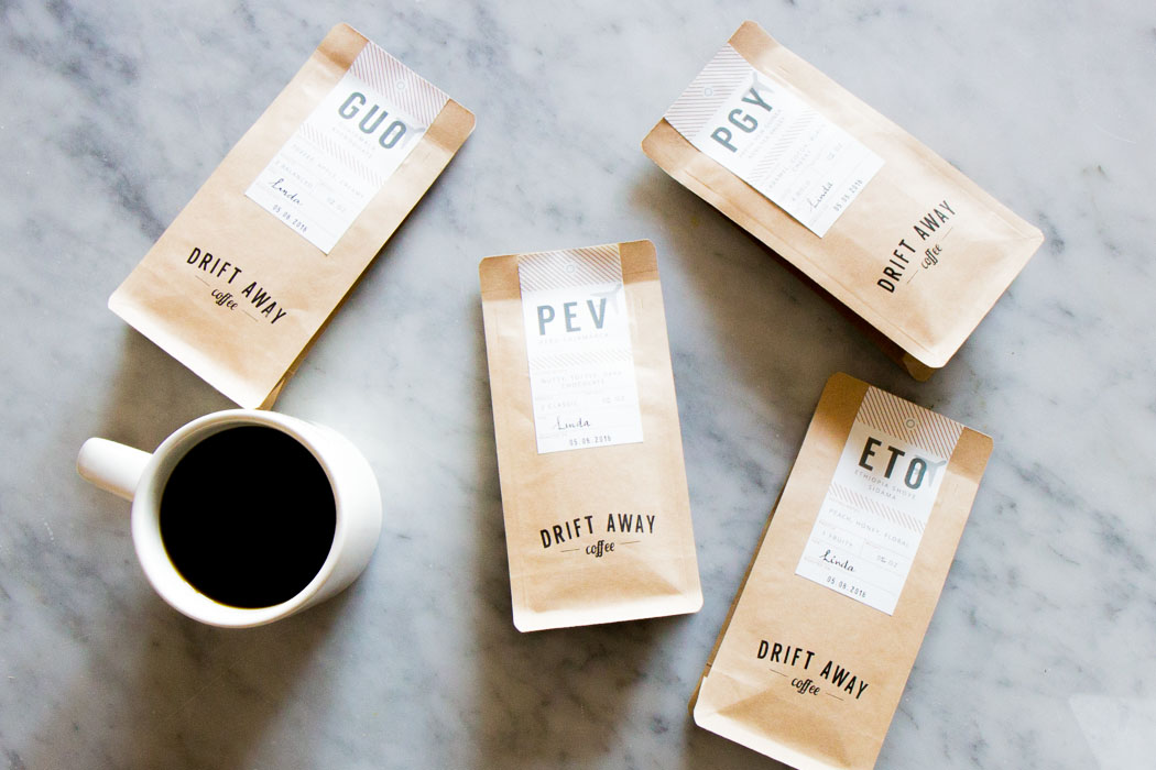
We at Driftaway are excited to share our fresh and new packaging that will be rolling out in April 2016. We've been meaning to do this for a few months and are really really happy with how it turned out. Packaging is the first thing that everyone will see, touch and feel, and we know A LOT of people love the hang tags - we felt the pressure from the get-go on this project to produce something we would be proud to create, proud to share and put in front of you.
THE STORY BEHIND THE TAGS
When we first started working on Driftaway, we began with a test. We wanted to build the simplest form of Driftaway quickly, so we could get it in front of people ASAP, and then learn from feedback & iterate quickly.
We had already done one preliminary test with friends, and realized that, even for a test, packaging design & branding was critical. So I started working on packaging design. We weren’t necessarily looking for things that scaled. And since I didn’t have a design background (other than working along side some amazing designers at SapientNitro), my aim was to put together a basic well-designed package that we could print at home.
I started scouring the internet for inspiration. I came across vintage baggage tags, and was struck with an idea: what about vintage baggage tag-inspired coffee labels? After all, though we may not think about it with every cup, coffee does travel thousands of miles before getting to us. I felt like this would be a great way to celebrate that coffee journey.
The vintage tags looked simple enough to not intimidate me. I also liked the idea of tying them to the bag, which seemed a faster way for us to start than to figure out labels. So I downloaded Sketch (Suyog had heard about it from his designer co-workers) & got going.
First attempt
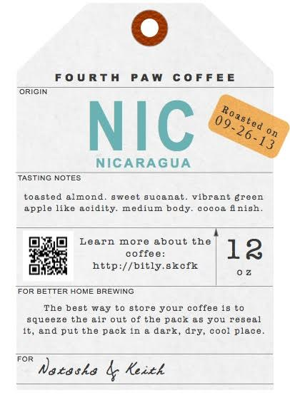
Final version for the test
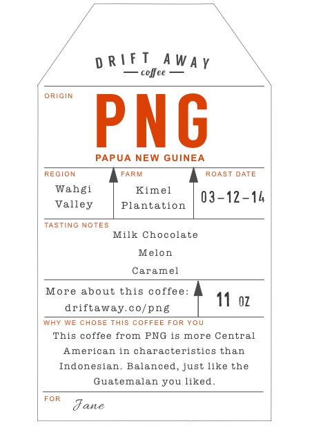
We still didn’t have a name for the company at this point!
We iterated a few times, and finally put this together for the test.
From the first test, the one thing, other than the coffee, that people talked about was the packaging. Everyone absolutely loved it!
Over time, we kept making small changes so we could scale, including have it eventually printed by the fabulous St Louis Tags.
SO WHY CHANGE?
1) Versatility - the best designs are versatile for different environments. We received feedback about the bags, and specifically the tags, not being suited to a retail environment (like a shelf in a store). Since the tags are hanging loose by a thread, there's a chance they might get cut off or tear. Since there isn't another marker on the bags, thats a lost bag of great coffee.
2) TMI - We received feedback from customers that there was simply too much information on the tags. Elevation, varietal, region are important factors for coffee, but it's not the 1st level of information that everyone looks for. We've been supplementing this information with coffee post cards and those have received great feedback.
3) Pack coffee faster - In the beginning, Anu and I roasted, sealed, filled and shipped each bag ourselves. As we've grown, we've started getting people and a couple of machines to help us. And we've tried to be more efficient as we go, so that all bags of coffee are roasted and shipped out very very quickly (less than 8 hours on most days). In the search for more efficiency, we've learned that tying tags by hand is the part that takes the most amount of time in our assembly line. So we set out to fix that!
OUR PROCESS FOR THE NEW PACKAGING
When we started redesigning the labels, here were our guidelines:
1) Celebrate the Journey
We wanted to maintain the original concept of the vintage baggage tags. Over time, this inspiration had expanded to be more than the journey coffee took. It had become a central theme to Driftaway -- Celebrate the Journey. We felt that the Driftaway moment was that one moment, when you drink your coffee, and can pause the craziness of the day, and just savor the moment.
2) The Coffee Acronyms
The three-lettered acronyms originated from the vintage baggage tags, and have become the name of the coffee itself. Over time, we realized that they seemed like an easy way for everyone to remember our coffee names, and had become synonymous with each coffee itself.
3) Paddle-swim-dive
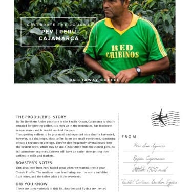
In the design of the information that goes on the new label, the coffee info card and the web page associated with each coffee, we followed a user experience and information design philosophy of paddle-swim-dive. The label shows you basic information about the coffee, it's source, taste, profile and quantity - allowing you to paddle into the pool. The coffee info card gives a lot more information about the varietal, altitude, mill or farm as well as more color on the origin story. It's something we imagine everyone reads as they sip on their coffee! It allows you to swim and have a full experience. Now if you are really interested, the web page about the coffee provides a lot more technical information about the coffee, what each of the pieces of information mean, photos from origin as well as the ability to buy more of the coffee if you loved it! That's the deep dive.
DESIGN ITERATIONS
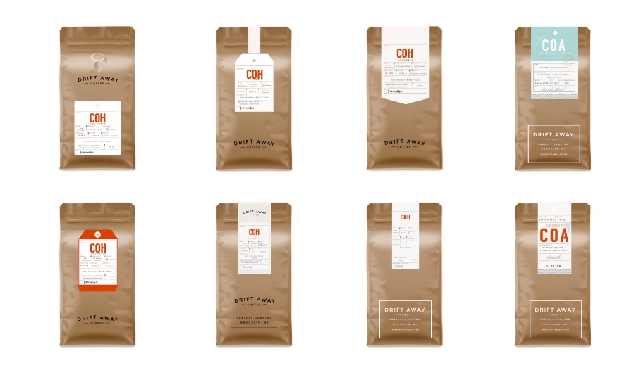
My first inclination was to convert the existing hang tag to a label, but the design just didn’t work. So I went back to the drawing board, and looking at various vintage hang tags, tried many different designs. After trying many out, we finally landed on one that we felt just right!
INTRODUCING THE NEW PACKAGING
We also had to figure out sourcing of the label. The design would only look great if the labels had some texture, and so we hunted quite a bit. We finally found Frontier Labels - and though we have only printed this first round with them, the experience has been wonderful!
COFFEE INFO CARDS REDESIGNED
WHAT'S NEXT
We've got a lot planned for this year for Driftaway. Upcoming projects include adding our story on the coffee pouch, as well as a new envelope (perhaps a box?). We couldn't and wouldn't do any of it if it weren't for our really amazing Driftaway customer family. Thank you for being with us.
Let us know what you think of the new packaging in the comments below, on Instagram or Twitter. We would love to hear from you.
